Importance of a well-designed landing page
A landing page is a standalone web page that is designed to capture the attention of your target audience and encourage them to take action. It is where your potential customers "land" after clicking on an ad or a link in an email or social media post.
The design of your landing page is crucial because it can make or break your conversion rate. A well-designed landing page can help you:
- Deliver a clear message that resonates with your target audience - Encourage visitors to take a specific action, such as filling out a form or making a purchase - Build trust with your audience and establish credibility for your brand
On the other hand, a poorly designed landing page can cause visitors to bounce off the page quickly and damage your reputation.
Headline and subheadline
The headline and subheadline are the most important elements of your landing page. They are the first things that visitors see when they land on your page, and they should be attention-grabbing and concise.
Your headline should clearly communicate the value proposition of your product or service. It should be clear, concise, and focused on the benefit to the customer.
Your subheadline should further elaborate on your value proposition and provide more information about what your product or service can do for your customers. It should be a bit longer than your headline and should provide more context.
Your headline and subheadline should work together to create a strong value proposition that encourages visitors to keep reading and take action.
Call-to-action (CTA)
The call-to-action (CTA) is the most critical element of a landing page. It is the button or link that visitors click to take the desired action, such as filling out a form or making a purchase.
Your CTA should be clear, concise, and prominently displayed on your landing page. It should be the most visible element on the page, and it should be placed above the fold.
Your CTA button should use action-oriented language that communicates the benefits of taking action. For example, instead of using a generic CTA like "Submit," use a more specific and persuasive CTA like "Get Your Free Ebook Now" or "Start Your Free Trial Today."
Form and lead capture
Your landing page should include a form that visitors can fill out to provide their contact information. This form is crucial for lead capture and can help you build your email list and generate leads for your business.
Your form should be simple and easy to fill out. It should only ask for the essential information that you need to follow up with the lead, such as their name and email address.
To encourage visitors to fill out your form, you can offer them an incentive, such as a free ebook, a discount, or a free trial. This incentive should be prominently displayed on your landing page and should be closely related to your value proposition.
Social proof and trust signals
Social proof and trust signals are elements that help build trust with your audience and establish credibility for your brand.
Social proof can come in many forms, such as customer reviews, testimonials, case studies, and social media mentions. Including social proof on your landing page can help you build trust with visitors and encourage them to take action.
Trust signals can also come in many forms, such as security badges, guarantees, and certifications. Including trust signals on your landing page can help you establish credibility for your brand and reassure visitors that their information is safe.
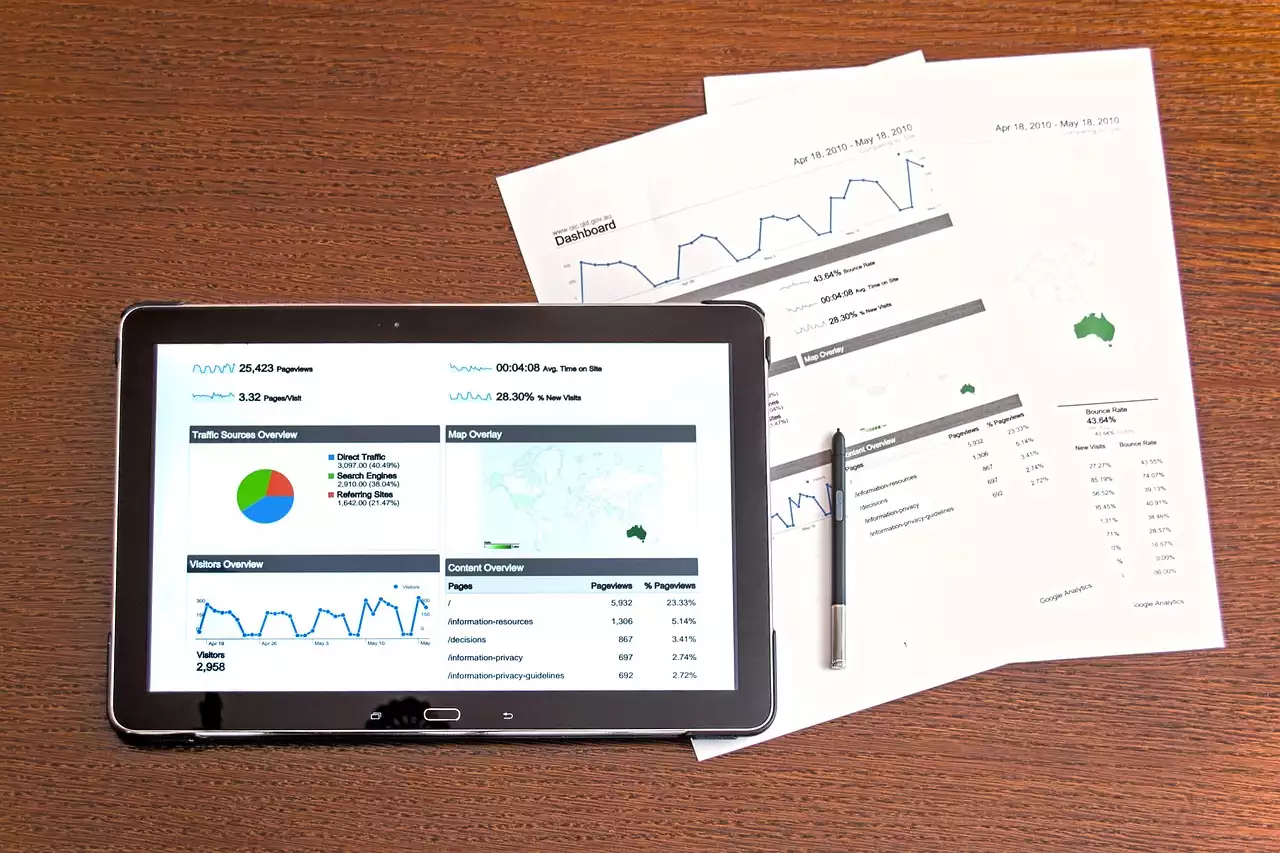
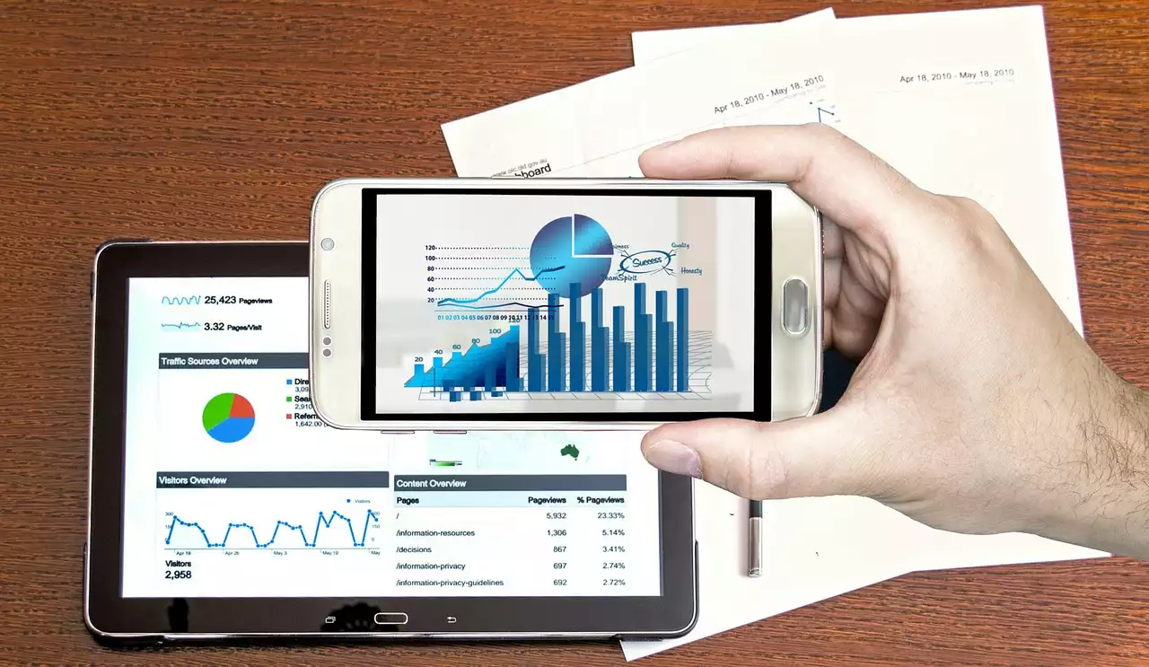
Visual elements
Visual elements, such as images and videos, can help break up the text on your landing page and make it more engaging.
Your visual elements should be high-quality and closely related to your value proposition. They should also be optimized for fast loading times and should not slow down your landing page.
Including visual elements can help capture the attention of your audience and keep them engaged with your content.
Landing page optimization tips
In addition to the five key elements we've discussed, there are several landing page optimization tips that you can use to improve the performance of your landing pages.
- Keep your landing page simple and focused on one goal
- Use contrasting colors to make your CTA button stand out
- Use bullet points and short paragraphs to make your content more scannable
- Optimize your landing page for mobile devices
- Test different variations of your landing page to see what works best
By implementing these optimization tips, you can improve the performance of your landing pages and increase your conversion rate.
Examples of successful landing pages
To help you get a better idea of what a successful landing page looks like, here are a few examples:
Example 1: Dropbox
Dropbox's landing page is simple, clean, and focused on the benefit to the customer. The headline and subheadline clearly communicate what Dropbox does, and the CTA button is prominently displayed above the fold. The page also includes social proof in the form of customer logos and testimonials.
Example 2: Slack
Slack's landing page is visually appealing and uses a video to demonstrate the product in action. The headline and subheadline clearly communicate the value proposition, and the CTA button is prominently displayed. The page also includes social proof in the form of customer testimonials.
Example 3: HubSpot
HubSpot's landing page is focused on lead capture and includes a form that visitors can fill out to download a free guide. The headline and subheadline clearly communicate the value proposition, and the CTA button is prominently displayed. The page also includes social proof in the form of customer testimonials and trust signals in the form of security badges.
By studying these examples, you can learn from the best practices of successful landing pages and apply them to your own campaigns.


.png?size=50)


